From Touchdown… to lift off!
Doing great work leads to more opportunities, there’s no doubt about that and it’s a driving dictum of every project we’re engaged on.
When Touchdown PR got in touch with us to review and pitch for their brand and website overhaul, it was, therefore, gratifying to learn that our team had been recommended to them by another client.
Great start, but the proof is always in the pudding! Through conversations and formal briefing with the team at Touchdown, we formed a clear creative vision and set to work developing our proposal to revamp and elevate;
- an aesthetically shabby but content-rich website, lacking engagement and navigation rationalisation,
- and a perfunctory logo, at the end of its working life.
The keys to any success in the realms of branding and digital are of course understanding and harnessing the central objectives of the project and its leaders. Touchdown communicated clear drivers, wanting to reflect their business as it stood today, their successes, their clients, their team, and their holistic services suite.
So, who are Touchdown?
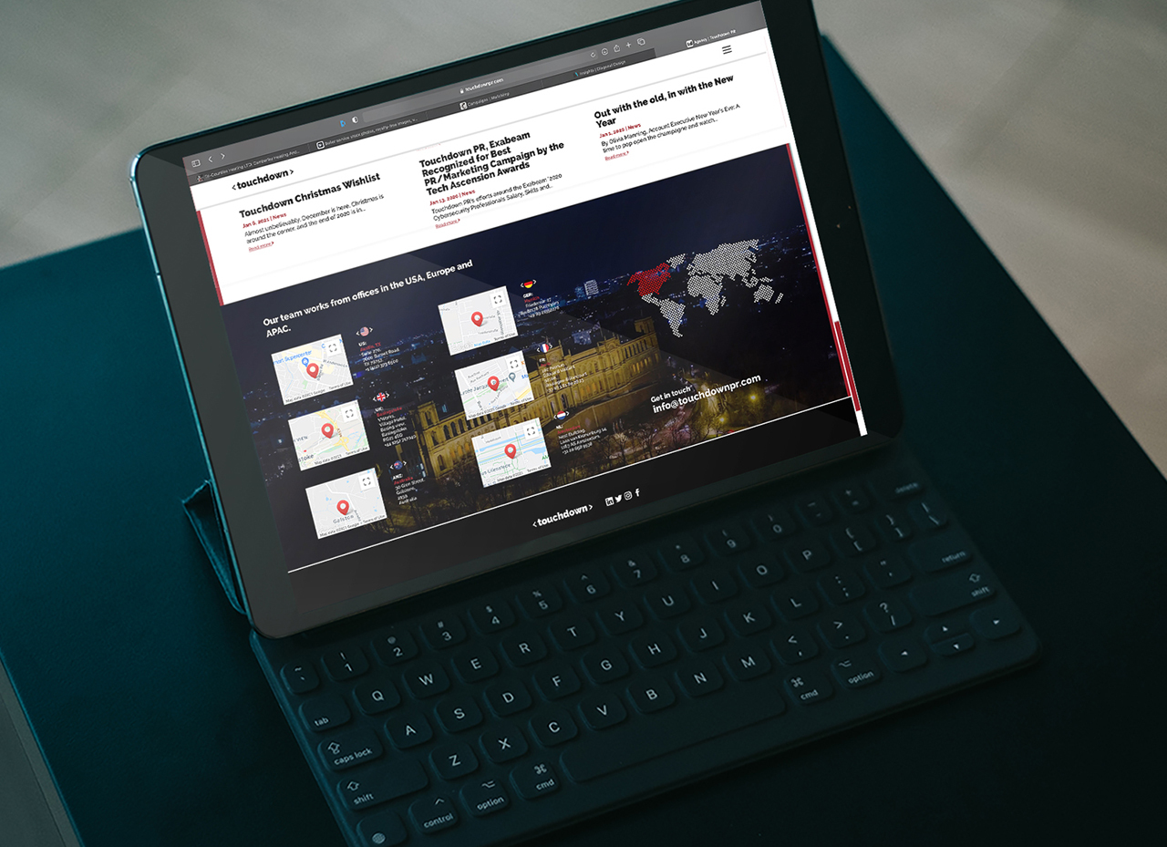
An international enterprise technology PR agency with 50+ staff in offices across the globe, including USA, Europe, Australia, and Singapore.
The agency specialises in enterprise technology innovation ranging from mobility, cybersecurity, data protection/management and storage to networks, communications, big data, Artificial Intelligence and cloud.
When assimilating the brief, words and phrases start lifting off the page for our creatives…. enterprise technology, global, innovative, cool clients, driven team, dynamic, specialist, and proven.
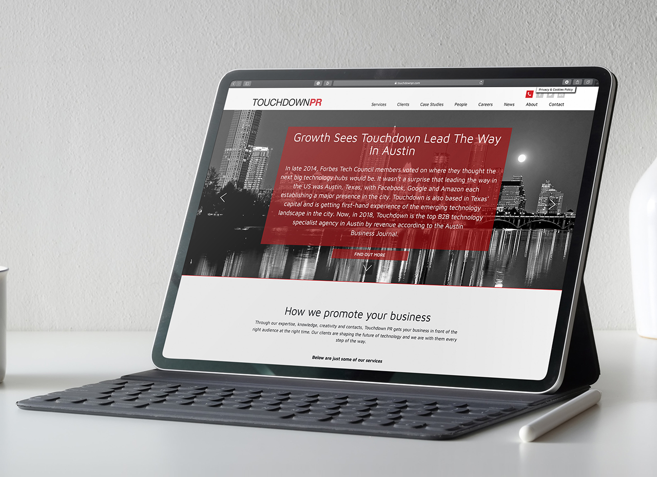
Old website
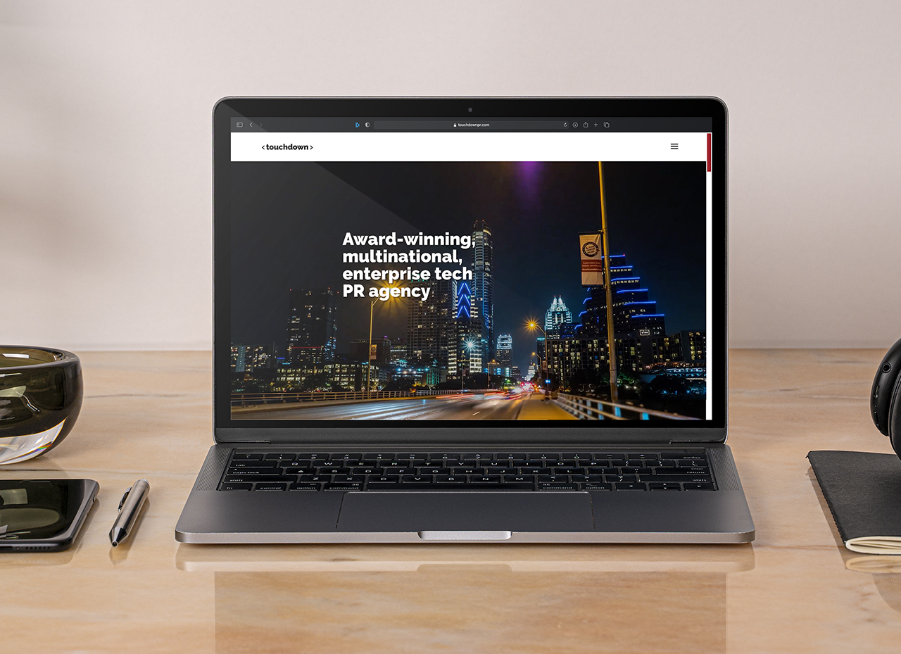
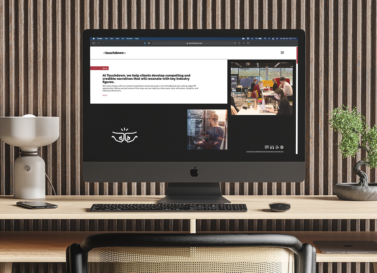
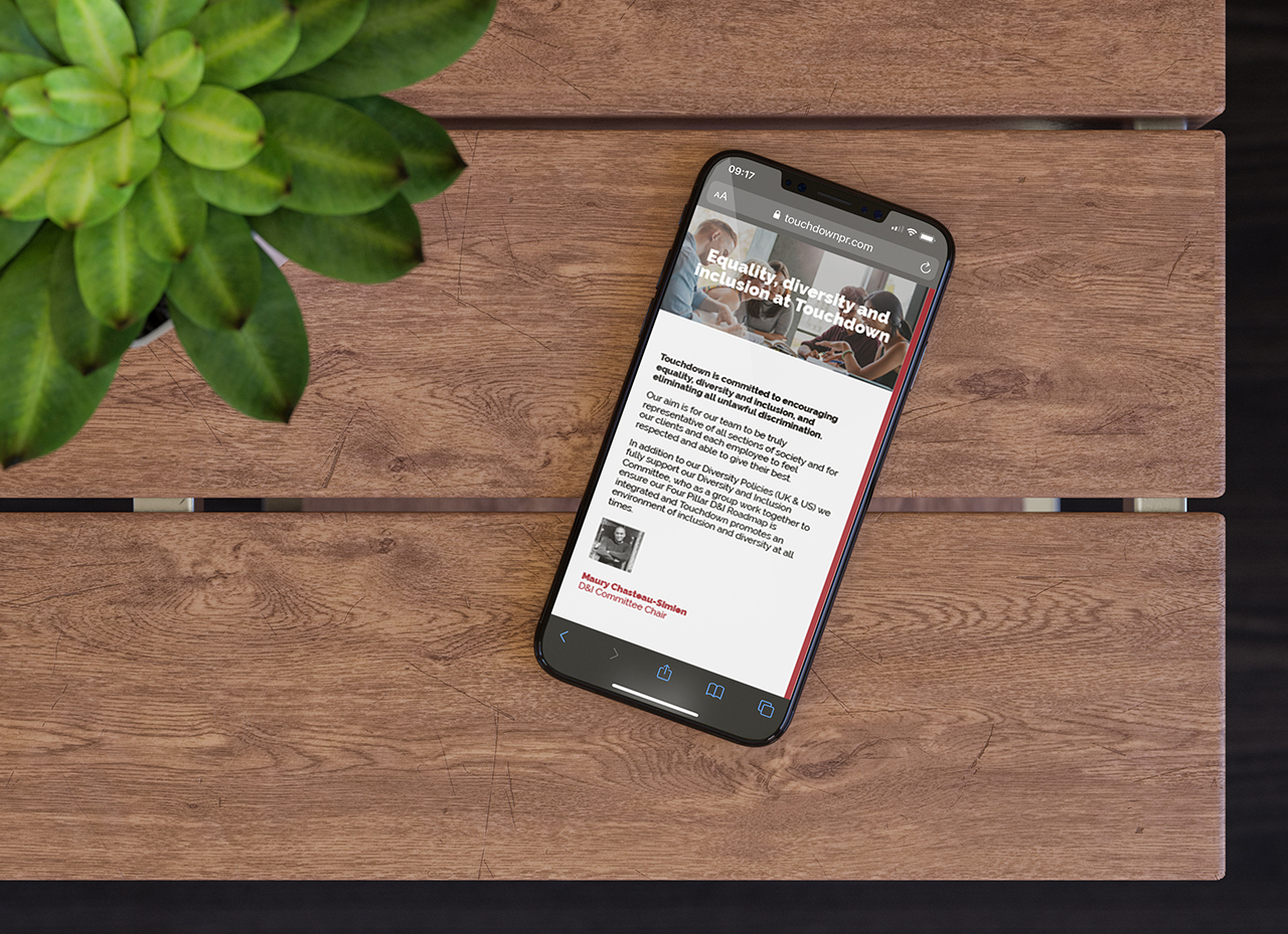
Our revamp
Our work then began to deliver the visual amplification of these brand touchstones.
As with all the most challenging and rewarding projects, the schedule was tight! So swiftly, we swatted up on Touchdown’s primary competitors, researched and reviewed their clients and delved deep to understand their sector, purpose, and place.
Our focus starts to sharpen, the vision starts to form, through creative craftsmanship, typographical developments, and asset sourcing, over the course of a series of days and evenings, we alight upon ‘the designs’. We love them, they zing, they pop and they hit all the marks, we can’t wait to pitch.


The day of the unveiling arrives. The client is immediately delighted, impressed, enthused… and on-board. We nudge out our competitor agencies and win. We have lift-off!
The build of the site begins, we work to the plan and at pace. Injecting dynamism and UX flair through striking features and functions to promote both user engagement and the brand’s core values;
• iconography and illustration,
• bespoke brand animations,
• customised video media integrations,
• UI web development executions, through, scrolling, loading, sidebar behaviours, and more.
Over the weeks to come, we develop an outcome we’re proud of, that the client adores and we work to achieve launch, on-point, on-brand, and on-time.
Most importantly, we all know it has faithfully hit the mark, meets and excels the brief, and powerfully reflects Touchdown’s thriving, award-winning agency and expert global team.
Of course, you’ll want to see it now! Welcome…
What the client says:
“With Touchdown turning 15 this year, we wanted to celebrate this milestone with a new brand for the business. We were recommended Diagonal Design and we sure weren’t disappointed with the outcome. Diagonal was able to accommodate not only our budget but our short time scales too and overall, delivered an exceptional updated website and logo for Touchdown. The final designs reflected our vision down to the final detail, with David and the team advising us at every step along the way.”
– Alexandra Morris, Brand and Marketing Manager
